DISCIPLINES
 Strategic
 Creative
 Print
Print
New look with a modern spin.
The Oregon Health Care Interpreters Association wanted a new face for their annual conference held in October. The first item on the list was re-structuring a simple conference logo.
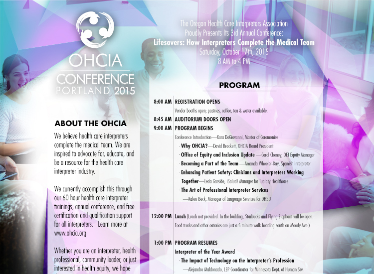
Updated style for new audience.
Putting together the program for OHCIA conference focused on one key goal: inspire the conference through a new style, look and feel.The best way to accomplish this was the use of geometric shapes with a hint of tertiary colors.
Custom Badge design
This conference required unique badges for attendees, volunteers, sponsors and board members. The development of all badges followed the updated geometric style set my the program design.