DISCIPLINES
 Strategic
 Creative
 Interactive
Slick, yet modern. Efficient and intelligent.
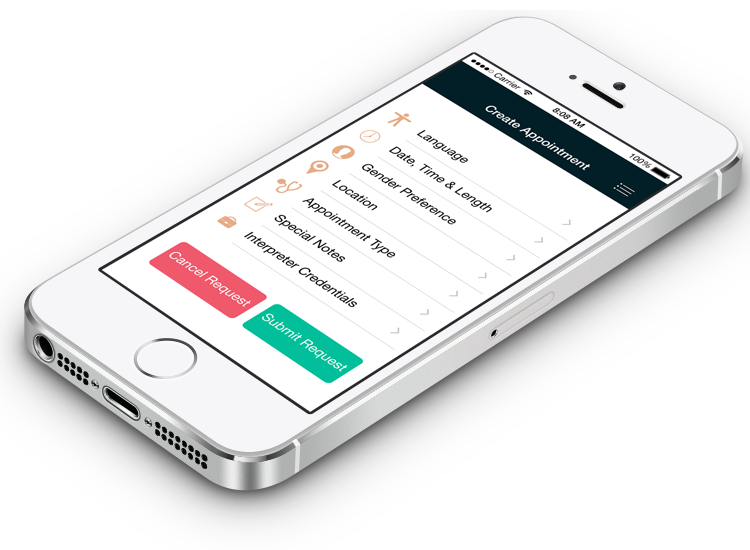
That was the intent behind Interrp—a mobile app created to facilitate the need for interpreters for patients, students, families and more. The neon blue represents a new age of mutually joining people via language, derived from the latin prefix inter, meaning together.


Minimal was the goal. Efficient was the drive.
Creating a simplistic navigation allowed the app's content to become more user friendly. Maintaining a 5-color palette gave the app a modern yet friendly look and feel.
Iconography. Checkmate!
Once a solid foundation was build from the brand to its goals, came the slick "22nd century" look. Minimalistic design was incorporated into every icon—after all, a picture is worth 10 words and 1 action.